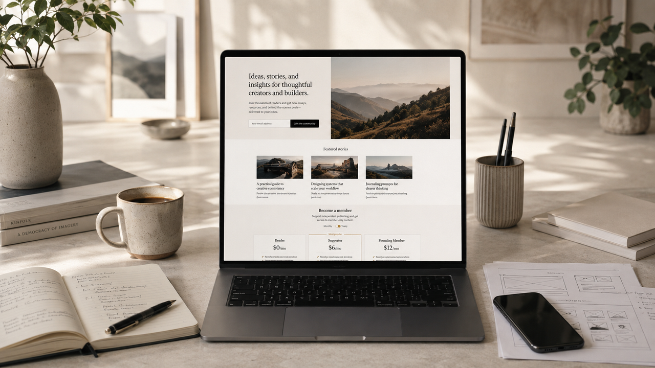
A homepage is more than the front door of a publication.
For independent publishers, creators, and newsletter businesses, the homepage is often the first serious moment of trust. A reader lands on the site, scans the headline, looks at the design, reads a few words, and quickly decides whether the publication feels worth their time.
That decision happens fast.
A good homepage does not try to explain everything. It helps the right reader understand three things clearly:
- What this publication is about.
- Why it is valuable.
- What they should do next.
When those three things are clear, a homepage becomes more than a design asset. It becomes a conversion system.
Start with a clear editorial promise
The hero section is the most important part of the homepage because it sets the expectation for everything else.
Many publication homepages fail because they use vague language. They say things like:
“Thoughts, stories and ideas.”
That may sound pleasant, but it does not give readers a reason to subscribe.
A stronger homepage promise is specific:
“Weekly strategies for creators building profitable independent publications.”
This tells readers who the publication is for, what they will receive, and why it matters.
The best editorial promises are simple, direct, and audience-focused. They do not try to sound clever. They try to create clarity.
A good promise should answer:
- Who is this for?
- What topic does it cover?
- What outcome does it help readers achieve?
- Why should someone trust it?
If readers cannot understand the promise in a few seconds, they are unlikely to become members.
Make the subscribe action obvious
If the goal is to grow subscribers, the homepage should make subscribing easy.
That sounds obvious, but many sites hide the signup form too far down the page or use weak call-to-action language. A reader should not have to search for the next step.
Useful signup placements include:
- directly in the hero section
- after featured posts
- in the header
- near the footer
- on a dedicated membership section
However, the call to action should not feel aggressive. It should feel like a natural invitation.
Instead of:
“Subscribe now”
try:
“Join 5,000 readers getting one useful publishing insight every week.”
The better version gives the reader context and a reason.
People are more likely to subscribe when they understand what they will receive.
Show the value before the paywall
A homepage should not ask for trust before earning it.
Before pushing readers toward a paid membership, show them why the publication is worth following. This can be done through featured articles, recent essays, topic sections, testimonials, author credibility, or a clear explanation of the publication’s mission.
A strong homepage gives readers evidence.
That evidence might be:
- a featured essay with a strong title
- a list of popular articles
- a short author introduction
- quotes from readers
- clear topic categories
- a preview of member benefits
- a transparent publishing schedule
The goal is to reduce uncertainty.
A new visitor is silently asking:
“Is this worth my attention?”
Your homepage needs to answer that question before asking for money.
Use featured posts strategically
Featured posts are not just recent posts with bigger images.
They should represent the best of the publication. They should show the kind of thinking, quality, and value readers can expect after subscribing.
For a creator or publishing newsletter, strong featured posts might include:
- a practical guide
- a deep editorial essay
- a case study
- a framework
- a trend analysis
- a beginner-friendly starting point
Avoid featuring random updates or weak announcements. The homepage should lead with content that sells the publication.
A good featured post should make a reader think:
“If this is the free article, the paid content is probably worth exploring.”
Build trust with design
Design is not decoration. It is trust made visible.
A cluttered homepage makes a publication feel less valuable. A clean homepage with strong typography, good spacing, and calm visual hierarchy makes the content feel more intentional.
Readers often judge the quality of the writing before they read it. They look at the layout, images, typography, and structure. If the site feels polished, the content feels more credible.
A homepage that builds trust usually has:
- generous spacing
- readable typography
- consistent image style
- clear navigation
- fast loading
- strong mobile layout
- simple calls to action
- calm colors
- no unnecessary clutter
The best publication homepages feel easy to understand. They guide the reader instead of overwhelming them.
Explain membership without overcomplicating it
If your publication offers memberships, the homepage should explain the offer in simple language.
Do not make readers guess what they get.
A good membership section should answer:
- What is included?
- Who is it for?
- How often is new content published?
- What makes the paid version different?
- Can readers start for free?
- How much does it cost?
Keep the first explanation short. You can link to a full membership page for details.
A simple version might say:
“Become a member to get weekly deep dives, private essays, and practical publishing frameworks designed for independent creators.”
That is clearer than listing every small feature at once.
The homepage should create interest. The membership page can handle the full sales argument.
Give readers multiple paths
Not every visitor is ready to subscribe immediately.
Some people want to read first. Some want to learn about the author. Some want to understand the membership offer. Some are already convinced and just need the button.
A strong homepage gives each type of visitor a useful path.
Common paths include:
- “Start reading”
- “Subscribe for free”
- “Become a member”
- “Explore topics”
- “Learn about the publication”
- “View pricing”
This does not mean adding many competing buttons everywhere. It means structuring the homepage so readers can move naturally based on their level of trust.
The more expensive the decision, the more trust is needed first.
A free newsletter signup can happen quickly. A paid membership usually needs more context.
Use social proof carefully
Social proof can help, but only when it feels believable.
A homepage can use social proof in several ways:
- subscriber count
- reader testimonials
- publication logos
- author credentials
- community size
- quoted replies
- case studies
- membership numbers
But do not invent numbers or exaggerate. Fake social proof damages trust faster than no social proof at all.
If the publication is new, use honest credibility instead:
“Built for independent creators who want to own their audience.”
Or:
“Weekly essays on publishing, audience growth, and sustainable creator businesses.”
Clarity is better than fake popularity.
Design for mobile first
Many readers will first discover your publication on a phone.
That means the mobile homepage matters as much as the desktop version. A beautiful desktop layout is not enough if the mobile experience feels cramped, slow, or confusing.
Mobile homepage essentials include:
- fast loading
- readable font sizes
- simple navigation
- clear subscribe button
- strong spacing
- images that do not dominate too much
- forms that are easy to tap
- no tiny links
- no layout shifts
A mobile homepage should not feel like a squeezed desktop page. It should feel intentionally designed for small screens.
Reduce friction everywhere
Conversion is often lost through small moments of friction.
A form with too many fields. A confusing navigation label. A vague button. A slow page. A hidden membership link. A homepage with too many competing sections.
Each small problem lowers trust.
To reduce friction, ask:
- Can readers understand the site in five seconds?
- Is the main call to action visible?
- Is the signup form simple?
- Are the best articles easy to find?
- Is the membership offer clear?
- Does the site load quickly?
- Does mobile feel smooth?
- Are there unnecessary distractions?
A converting homepage is usually not the one with the most elements. It is the one with the clearest path.
The homepage is a promise
A homepage should not just look good. It should make a promise and then guide the reader toward the next step.
For independent publishers, the best homepage communicates:
“This is who we serve. This is what we publish. This is why it matters. This is how you can join.”
When that message is clear, readers are more likely to subscribe. When the reading experience feels premium, they are more likely to trust the publication. When the membership offer feels natural, they are more likely to pay.
The goal is not to pressure readers.
The goal is to help the right readers recognize that they belong.